Hello folks!
I would like to share the mockup designs I have been working for a while now, as showing my ideas/thoughts visually is better than trying to explain it (which I did here).
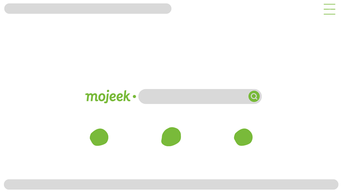
Homepage (Re-thinked where Mojeek logo can be presented, making the experience more consistent. Because as users search from the homepage, the results are shown in the results page, where the Mojeek logo is also on the left side of the search bar, similar to this mockup homepage):
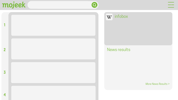
Search results page (Aimed at curving out the edges and giving Mojeek a well designed/modern feel, neatly incorporating results numbering in the left as a lighter transition from the main results background; same goes to the News results pop up on the right, neatly transitioning in the bottom from the infobox. This design also improves the usability of Mojeek, as there is a dedicated search result bubble inside the grey background for every search result and more given information for that search result.) :
The attached images above are the mockups I have been working on, trying to implement a modern(ly) designed UI for Mojeek, though please do note that the font used across the whole design is pretty much inconsistent as I couldn’t find out what font Mojeek really uses.
Having said that, I have also incorporated the results numbering idea from @mike’s post.
The goal here is to massively improve the user experience of Mojeek, making it feel more up to date/in-line with the other search engines in-terms of how updated/modern it feels, in-fact it is probably a lot more modern than even the UI Google or Bing uses as the mockup design I have implemented is a lot more consistent overall.
I would also like to take this as an opportunity to get my message out: Please make this one of the top priorities in the to-do list, as I am sure that the design team can take this as an advantage and even re-think some aspects of Mojeek’s UI and improve it massively. As someone who has shared Mojeek with a lot of people inside my known circle, I can tell you folks that one of the major feedback was the dissatisfaction with Mojeek’s current old-school UI itself, this post is aimed at tackling that.

