After using Mojeek for basically 2 days, I am pretty impressed with a search engine, that is built from the ground up without being dependent, the experience till now has been very pleasant and smooth. As I continue to use Mojeek, I can’t help but notice that the UI kinda looks old school. Some “very simple” tweaks to the UI could make it look much more consistent and modern.
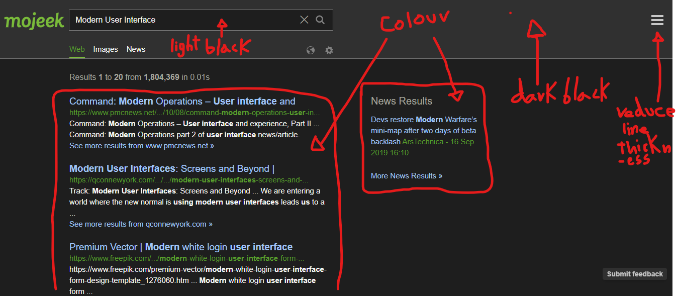
Before getting into the explanation, here is a visual presentation of what “tweaks” we could implement that could make Mojeek look a lot more modern.
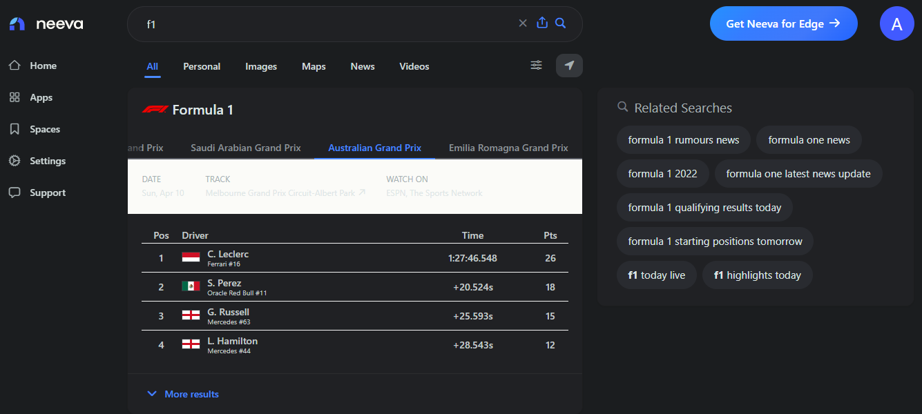
Similar design to what I am thinking in mind;
So to explain further just in case some things may not be clear;
- Change the whole background to the dark black we have in the search results area, because right now, in the search box area, the background black is lighter.
- Now use the lighter black inside/for the search box.
- We can have a bubble/box for the search results as drawn in the first Mojeek image attached above. Use lighter black inside the box, though the outer background should continue to use the dark black just like the Neeva design.
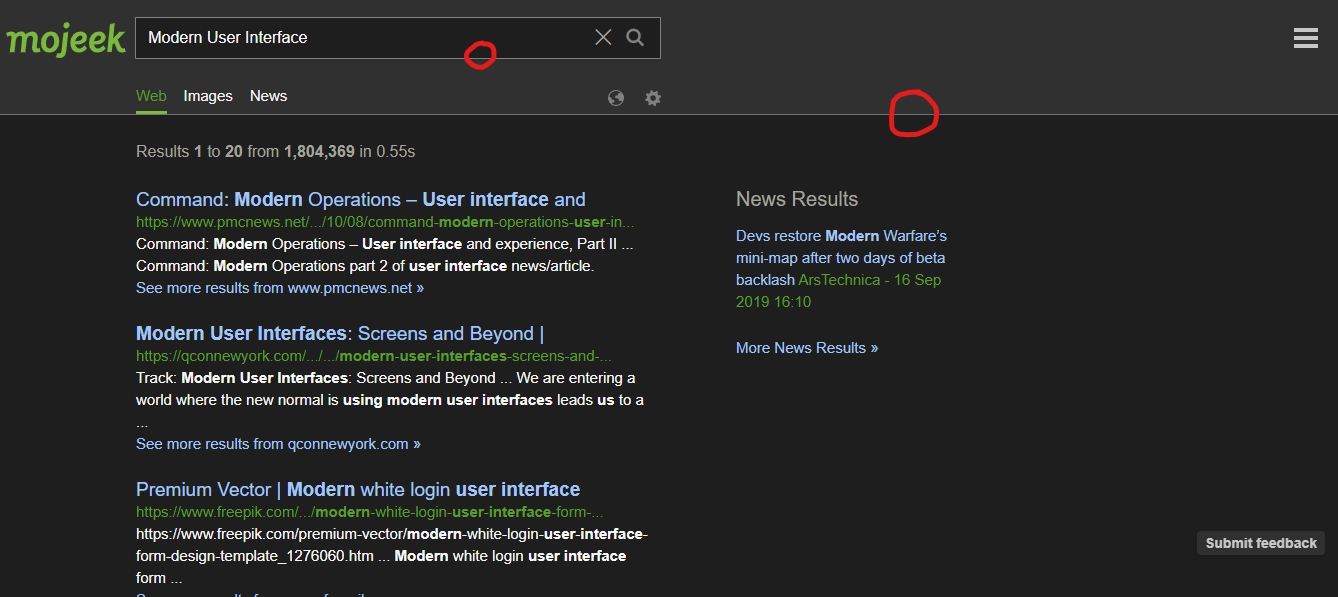
- Remove the white highlighting lines around the borders


- The Mojeek logo is also pretty close to the search box on the right of the logo itself, there is less space in there, so maybe we could make the Mojeek logo look slightly smaller
Making the UI modern might already be in the timeline, but just putting this out so you folks get an idea, I am no professional UI designer haha, but just sharing some of my ideas and mentioning things that makes the current UI look old school. This feedback is actually pretty much about simple tweaks to the current UI itself, not changing anything major, but just putting it out there.
Really love the fact that the Mojeek team is listening to its community and excited to help you guys out with things I possibly can 