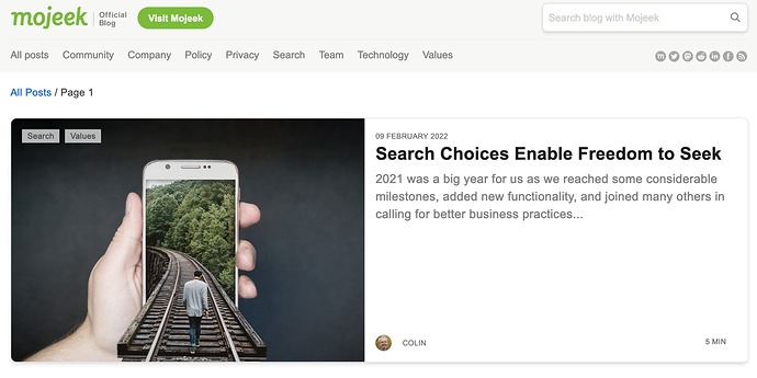
The new look Mojeek blog is live, complete with categories, header images, and a fresher design. Let us know what you think!
Looks nice. Might want to do an a11y check, though; I noticed an issue when using a screenreader (I sometimes use one for eye-strain): the social icons in the nav row are invisible without CSS but are still tab-focusable, which could be an issue for screenreaders.
After tabbing through nav links, screenreader users have to press “tab” another seven times for invisible links.
Otherwise, I don’t have any complaints.
Cheers @Seirdy, I’ll check it has been/get it looked at from an a11y standpoint, as well as the screenreader CSS issue.
Looks good. I did not immediately recognize the categories/tags as a menu along the top. I’m accustomed to seeing tags piled up in the right gutter.
Cheers for the feedback @mike, I think we did a quite involved process of looking at examples of others doing this well. I’m not 100% but I think the tags up top might have been something inspired by Vivaldi’s Blog.
The site looks fantastic Josh. Excellent job
Cheers @stu, I take little-to-no credit for the design side of stuff here, but it’s good to know that the new look is appreciated 
