Hello!
I thought of sharing a simple idea that popped up in my mind very recently, so put together a mockup that looks pretty simple, but that is pretty much it. I feel like right now, unless I am in the “web” section right now, I can’t really see the settings icon, nor the region icon when I am either in the image/news section, or the main homepage at mojeek.com
I this this would be a great idea, that would be very simple to implement;
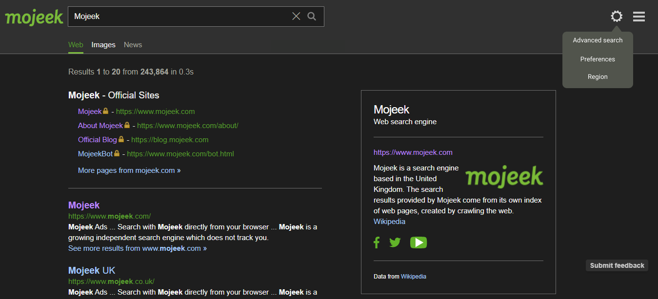
So I basically merged the “region” settings into the main settings along with “advanced search” and “preferences”. It is also now beside the 3 horizontal lines, making settings accessible throughout mojeek.com, doesn’t matter if you are in image section, news section, or even have mojeek.com set as homepage and need to access settings in one click, you will no longer need to put a query and be in the “web” section to access that. I feel like that would really be a fundamental/simple change that could impact my overall experience of using this product, as settings is the entry to personalize and make the search engine adapt to my needs 
EDIT: Now some here may say that the “settings” can already be accessed through the bottom of the screen/page beside “feedback, terms and privacy”. But guess what? I have been using Mojeek for weeks now, and I just edited this post because I just literally realized there is indeed a way settings could be accessed in the bottom of the page. Naturally, I assumed we would normally have the ToS, Privacy policy and all that stuff in the bottom (indeed that is how many search engines nowadays have), so I never really looked into it, especially for casual users who may be giving Mojeek a try coming from DuckDuckGo or even Google, many of us would just make an assumption that settings ain’t there in the bottom, because a lot of folks just put Privacy Policy and all the other stuff in the bottom. So I think making it more obvious would be great.
2nd EDIT: Looks like the “settings” in the bottom of the page actually takes you to the “preference” page, which is how it’s described in the “web” section’s settings (settings icon), but you still can’t access “Advanced search”, so just packing everything together and putting it under a settings logo beside the 3 horizontal lines would make it much more accessible. Especially in the image section, as you scroll down, the new images automatically loads up (like infinite scrolling) so I think it’s absolutely a headache to have settings down there.